One
unchanging feature of what passes for news, fake or otherwise, these
days is the performance of the “Dow.” It’s typically
included in every news summary, along with the weather and the latest
baseball — football? — trade, score and scandal. This past week,
the Dow Jones Industrial Index (DJIA) overshot 23,000, which is as
artificial a benchmark as having a birthday — you feel the same the
day before and the day after. The straight “points” number is
essentially meaningless by itself — what counts is the percentage
gain or loss. When the Dow goes up or down two percentage points in a
day, that’s news. That it hit so many thousand, not so much.
Again, think of birthdays: when you’re 20, a year is 5 percent of your life (kids: don’t squander!); when you’re 80, 365 days represents just 1.25 percent of your life as a whole. (Unless you ignore the past and focus on the future; if you think you’ll die on your 81st birthday, that upcoming year = 100 percent of the rest of your life. See how tricky this is?)
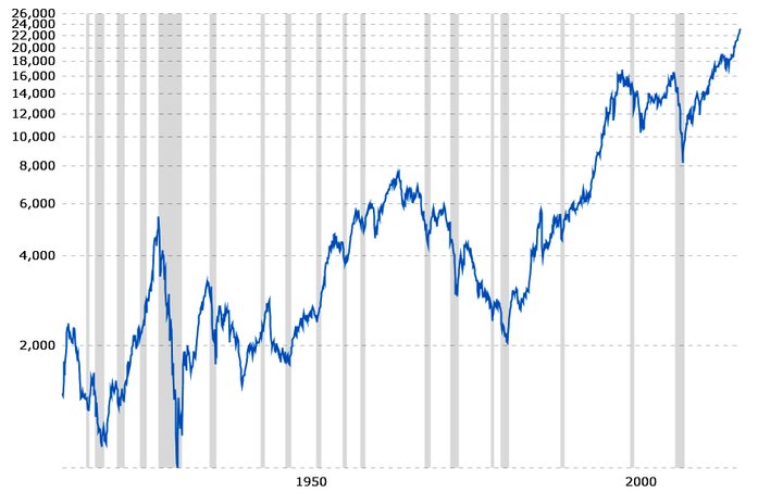
100 years of the Dow, 1917-2017, plotted on a log scale (2,000 to 4,000 scales the same as 4,000 to 8,000, making for meaningful comparisons). It surpassed 23,000 last week. (macrotrends.net)
In any case, there’s this myth that the Dow represents the state of the U.S. economy. It does nothing of the sort. Firstly, the Dow, or any stock index, or for that matter, any stock, represents the hopes and expectations of investors — looking to the future rather than the present. The number you hear on the radio or read in the paper is what “the market” — the collective mind of thousands or millions of punters — thinks will happen, tomorrow or next week or next month. Secondly, the DJIA is a poor stand-in for the economy as a whole because of its double bias: only 30 companies are represented and it’s price-weighted, see below.

Charles Henry Dow (Public domain)
The
Dow was created late in the 19th century by financial journalist
Charles H. Dow, who wanted to be able to report on the overall state
of the stock market with a single number. It’s the oldest financial
index, and represents about a quarter of the value of the entire U.S.
stock market because its 30 stocks are, in theory, the largest and
most influential in the country. Back then — 1896 — it was easy to
calculate the value of the Dow: you added up the per-share price of
each of its companies and divided by 30. (Today, thanks to stock
splits and other shenanigans, the divisor is more like 0.15.)
More of a problem with the DJIA is that it’s price-weighted, meaning that a percentage change up or down doesn’t necessarily mean that the entire market has gone up or down — or even that the Dow’s 30 companies have collectively gone up or down. A company with a high stock price affects the index more than one with a low stock price, irrespective of the relative size of the companies. So that, if a Dow stock worth $100 a share moves up by $1 (a 1 percent change), that affects the value of the index five times as much as a stock with share value of $20 moving by $1 (a 5 percent change). Which is nuts! It gets worse: a 5 percent gain in each of DJIA stocks doesn’t necessarily cause a 5 percent gain in the index.
A much better gauge of the health of the market (meaning, as I’ve said, the collective hopes and dreams of investors) is a capitalization- or market-weighted index: every stock is represented in proportion to its total market capitalization, or worth: the number of shares times the share value. With such an index, if the total market worth of all 500 S&P stocks increases by 5 percent, the index itself increases by 5 percent, clearly a more useful stand-in for economic health.
This is pretty much how all other stock indexes — there are hundreds — are calculated. Take the venerable (1920s) Standard & Poor’s 500 Index, aka the S&P 500. This index includes 470 more companies than the Dow and represents about 80 percent of the value of the total US stock market. You want even more representation? Use the Wilshire 5000 Index, aka the “total market index.” Or if your financial heart lies in the tech sector, you’ll follow the Nasdaq Composite Index. Are you nostalgic for the 1990s, when “small-cap” stocks (that is, shares of small companies) did very well compared to the rest of the market? The Russell 2000 is your guide.
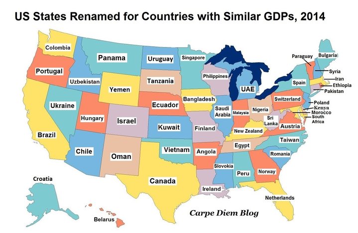
And that’s just what’s happening here in the US, although this telling map, from Mark Perry’s “Carpe Diem” blog, justifies focusing only on the economy of this country. Perry puts America’s vast wealth into perspective by comparing the GDP (gross domestic product) of individual US states to the entire national GDP’s of other countries. Bottom line, for better or worse: we’re freaking rich. (Or someone is; “trickle-down” always was voodoo economics.)
Meanwhile, all the financial news last week was about the Dow hitting the magic-but-irrelevant 23K. Great news for investors who have been wowed by this administration’s rash promises of deregulation and lower taxes. Terrible news for the long-term economic and environmental health of the country. But that’s another story.
CLICK TO MANAGE