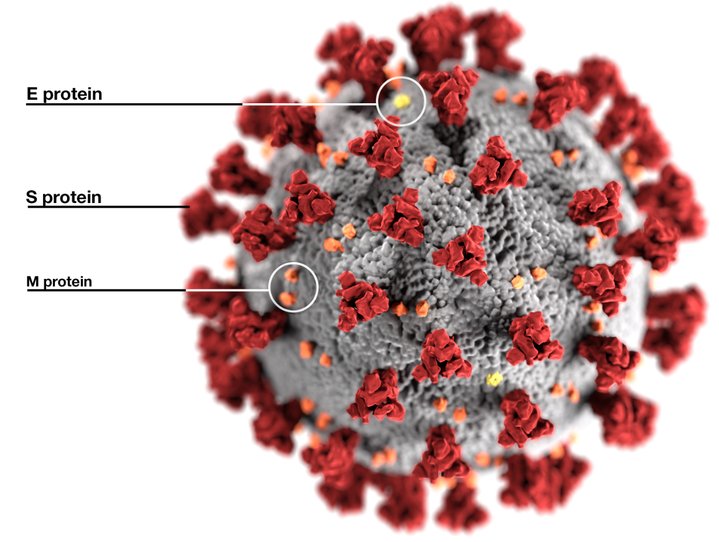
Couple of weeks back, I foolishly tagged this image as “Electron microscope photograph of coronavirus.”

Not the Death Star: illustration of SARS-CoV-2 virus. (Alissa Eckert and Dan Higgins, CDC). (This and all images are public domain.)
Never mind the (literally) incredible resolution, those colors are obviously fake. Why? Because electron microscopes examine things much smaller than the wavelength of visible light—which is why they’re used in the first place. They only “see” in black and white.
Optical microscopes, invented around the same time as telescopes, 1600 give or take a decade, refract (bend) light from the object being viewed to make it seem as if it’s coming from a much larger object. But what’s seen through the eyepiece is still light, red to violet, visible spectrum. The limitation on magnification is the length of the light wave—anything smaller than half the wavelength of the microscope’s illumination source is invisible. (As an analogy, imagine a big ocean wave encountering a slim vertical stick.)
The electron microscope gets around this limitation by using electrons—rather than photons of light—to transmit the image, and a strong magnetic field in lieu of glass lenses. Practically, it has a resolution about a thousand times that of the best optical microscopes, that is, about 500,000 times that of the human eye. Since the ersatz “wavelength” is so small, way below that of visible light, there’s no color to be seen. Any color you see in an electron microscope image has been added artificially.
In the case of the image above—the one that has virtually become the logo of the SARS-CoV-2 virus (cause of COVID-19) used in countless stories about the pandemic—a small team at the Centers for Disease Control and Prevention led by medical illustrator Alissa Eckert created it in a week, starting on January 21. Using Autodesk 3ds Max, Eckert came up with “something to grab the public’s attention,” as reported by the New York Times last week. Up until then, no one had imaged an actual SARS-CoV-2 virus, but the team did have electron microscope images of other coronaviruses, including the ones that led to SARS (Severe Acute Respiratory Syndrome, China, 2003) and MERS (Middle East Respiratory Syndrome, Saudi Arabia, 2012). Plus, medical researchers had a pretty good idea what special features SARS-CoV-2 would have.
Eckert said that she decided to emphasize the S “spike” proteins in red, because these are the features of SARS-CoV-2 that make it so infectious. The spikes (looking vaguely like a corona, or crown, that give coronaviruses their name) have effective molecular “grappling hooks” (receptor-binding domains) and “can openers” (cleavage sites) that allow the virus to grab onto and penetrate the walls of its hosts’ cells (specifically, human ACE-2 cells). Also seen in the image: E, envelope proteins (yellow) and M, membrane proteins (orange). The envelope contains the short ribbon of RNA with its 30,000 nucleotide bases, the “brain” of the virus.
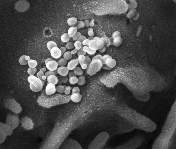
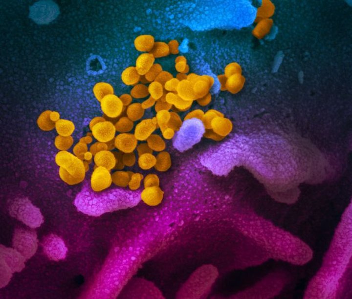
It wasn’t until mid-February that actual SARS-CoV-2 viruses were imaged, by the Rocky Mountain Laboratories (RML) at the National Institute of Allergy and Infectious Diseases. Here they are, first in the electron microscope black-and-white view, then artificially colored. They, and the accompanying cells, were taken from an early US patient infected with COVID-19.

RML/NIAID (color removed by author)

RML/NIAID (as released to the press)
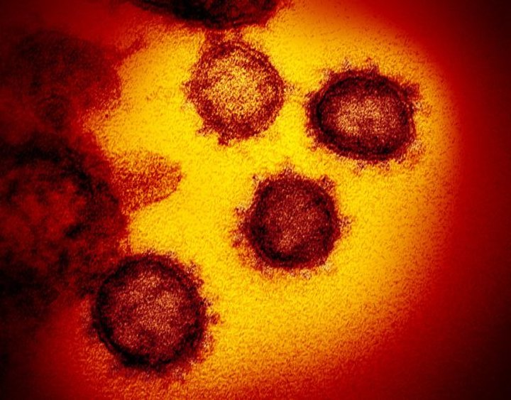
And here, again artificially colored, where the “spikes” can be seen easily.

RML/NIAID
So just how small are these potentially-lethal critters? Really small, between 50 and 200 nanometers (billionths of a meter) in diameter, which makes them about 1,000 times smaller than typical bacteria—hence the need to image them with electron, not optical, microscopes. As a quick and dirty way of visualizing them:
Your size compared to that of a grain of salt is about the same as that of a grain of salt compared to the virus.
Trying to get my head around that while looking at the CDC image that began this column is pretty weird. Time for some more social isolation.
CLICK TO MANAGE